Now, this is just a thing I wanted to do. I'm going to post album artwork that I particularly enjoy and detail why they are such works of art. I especially want you, our fans, to do the same! Participate and get in there! I'll start the shenanigans.
Hüsker Dü's Metal Circus
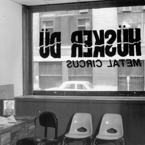
Now, what is so great about this piece is the composition on it. The backwards lettering, the picture on the desk, the chairs. It's all things you can feel because they're close to real life and in that you get that feeling of warmth and familiarity. The backwards letters may signify some thing to the extent that it's meant to be viewed from the outside looking in (where the letters would be properly written). Either way, the grayscale colour scheme, the letters, the cover. EVERYTHING is great.
Life, Liberty, and the Pursuit of: Louder Than Bombs
Favourite Album Covers of All Time.
JayFantastico
at 10:24PM, Aug. 31, 2009
last edited on July 18, 2011 10:15AM
McFadyn
at 8:52AM, Sept. 1, 2009
Yea and the fact that Mao is sitting there staring into your soul. hehe.
I was always a big fan of AFI's Black Sails in the Sunset:
LouderThanBombs
last edited on July 18, 2011 10:15AM
I Am The 1337 Master
at 3:34PM, Dec. 8, 2009
last edited on July 18, 2011 10:15AM
JayFantastico
at 1:01AM, Dec. 15, 2009
Next one:
Fluent in Stroll by Big D and the Kids Table
There are many reasons why I like this piece. The woman looks like it'd be from an old magazine like the “Saturday Evening Post”. Her hair cut suggests that. Suggesting that the music may be influenced from older stylings but then the womans face is blown off exposing colours and butterflies. It's almost saying “We know our roots and we know how to make it ours”, which is what this record does. That idea can be seen again in the Venn diagram enclosing the title. Saying “This side is the old, this side is the new and we're in the middle”.
Great alum cover. Stunning.
last edited on July 18, 2011 10:15AM
©2011 WOWIO, Inc. All Rights Reserved Mastodon