Chapter 01 Page 01
silentkitty on Jan. 15, 2007
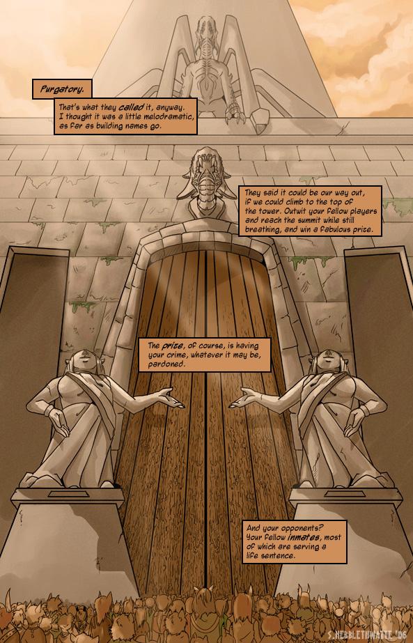
I just had this site pointed out to me by someone, so I decided I'd check it out. =) Seems like a fun place, so hi! Page one! I'm still not really happy with the angle here, but I messed with it for so long I was starting to go cross-eyed. I may go back and re-draw later, but.. yeah. Later.


HugoSIII at 7:32AM, Aug. 17, 2009
Faved
falconire at 12:13AM, Aug. 13, 2009
Faved!
Gendgi at 6:15AM, June 10, 2009
*drops jaw...woOow amazing...
Samota at 9:26AM, April 28, 2009
wow great art and coloring!!! and love your user pic!:) fav:)
CryForE at 11:20AM, April 8, 2009
Looks really great! :D
katyas at 9:10AM, June 1, 2008
That's an AMAZING perspective! And all the little peoples in front of the door!! I see where the "reality TV" thing mentioned in "Off Hours" came from now ... Survivor: Purgatory Tower! Heh.
PurplePeopleEater at 12:43PM, April 23, 2008
I just found this comic. First page is awesome. I love the angle and how the text boxes lead your eye down to the inmates. Excellent. Looking forward to reading the rest!
Chuckee at 4:40PM, April 13, 2008
Hmmm.... Came all the way back so I could link this to my brother, and then I realized that I never commented on it, so now, I gives a 5
Scorpious at 8:01PM, April 4, 2008
now that is perspective damn!
Kenz Lee at 8:52AM, March 14, 2008
Really beautiful, that angle is so hard
whitehawk at 11:26PM, Jan. 16, 2008
Nice perspective. Good start -huge door as first image
Amelius at 7:50AM, Jan. 10, 2008
Ooo, impressive perspective and crowd! the detail on the wooden door is quite nice too.
ArtMonk at 9:27AM, Nov. 6, 2007
Luv the overall peachy atmosphere color.
simonitro at 11:40AM, Sept. 22, 2007
Hmm... very interesting!
chartreuse_tea at 7:07PM, Sept. 4, 2007
This is a very refreshing comic!
Hit_Rock Aqtrox at 7:47AM, Aug. 10, 2007
interressting
TheMidge28 at 11:35AM, Aug. 8, 2007
I tyhink the angle is fine...its the fox people near the bottom...I didn't initially notice them when I first viewed the page. maybe bringing one of them closer to the foreground...but the page is gorgeous...if that's the only problem with the page...still a great page!
Eagle0600 at 1:17AM, July 7, 2007
I love the concept, don't disappoint me. 5 for coming up with the idea.
junglistikat at 2:27PM, June 9, 2007
sick comic, love the detail you put into each frame. Very nice job, especially for your first time dealing with color in mass production.
Foxy at 9:27AM, June 7, 2007
Yaay, furries...! Or... Partial furries, because they're just eared and tailed, aren't they? =/
Andaren at 6:11AM, May 21, 2007
sounds very much like battle royale. I like the art style :)
bertito at 7:24AM, Feb. 1, 2007
good work give me ideas
mayshing at 12:50PM, Jan. 28, 2007
Wooo nice work, professional. Fitting layout for the comic presentaiton too. Love the coloring, I will keep watch.
hs5k at 11:04PM, Jan. 26, 2007
WOW! This comic looks amazing!
timlight at 4:16PM, Jan. 24, 2007
fantastic intro & great drawing