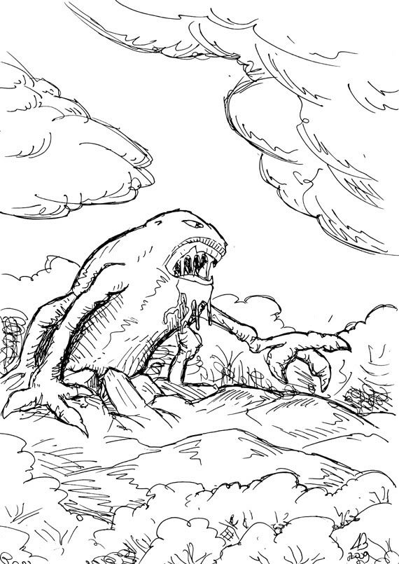
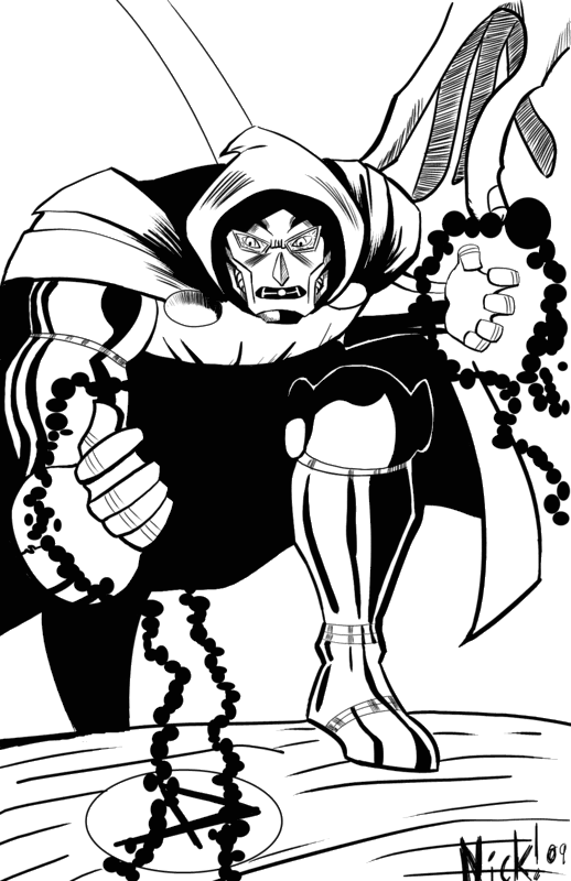
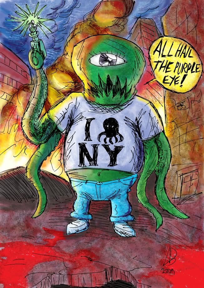
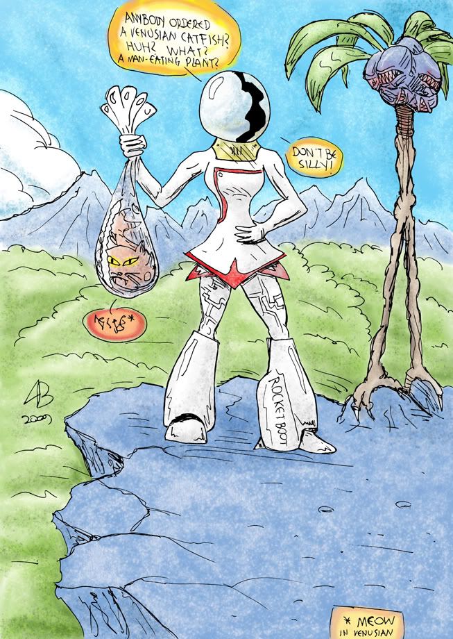
so here goes, ill start:

subcultured
so the rules are to comment about the art piece of the previous poster. and then post your own art work (kind of like the other topic on the comic subforum)
so here goes, ill start:


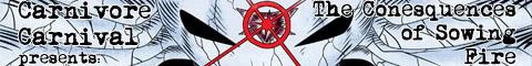


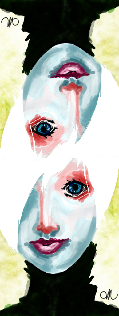

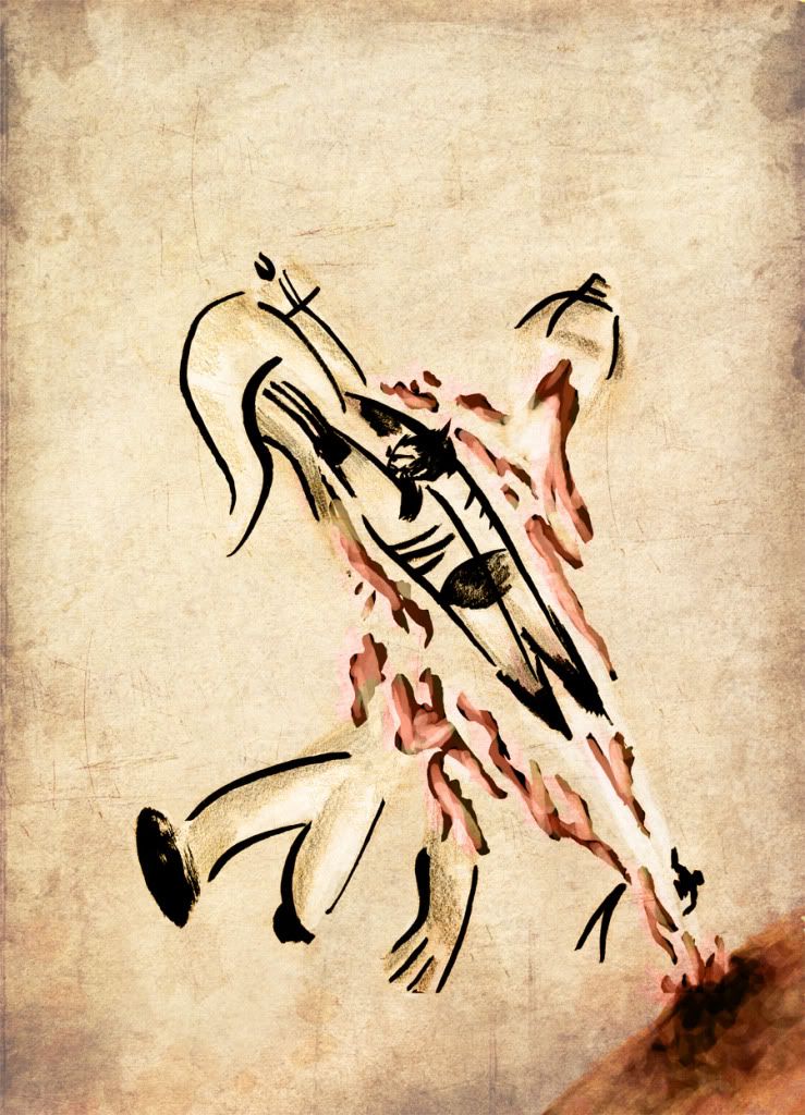
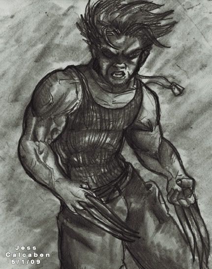
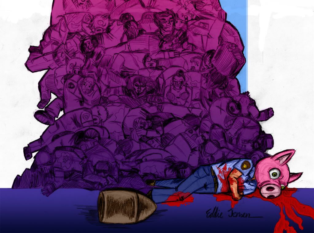
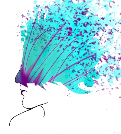
worstcaseCool, reminds me of a royal card, as well as being freaky and mutated. Nice radial symmetry and the colourong has a nice contrast and watercolourish effect. :)
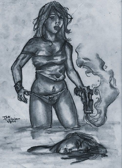
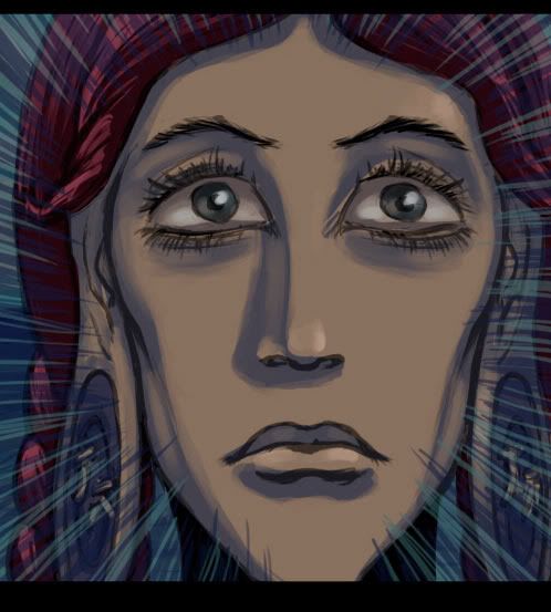
Here's mine:


Freegurt